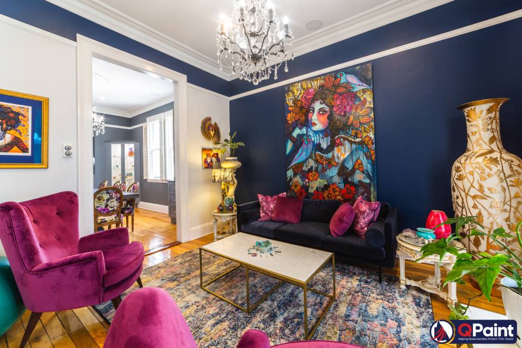
Thinking of painting your home and want to know the paint colour trends forecasted by the interior design experts for 2023? As professional Brisbane painters we see the trends and know what works. Trends in interior design are as cyclical as those in clothing and furnishings. The good news is that updating your walls is practically as simple as updating your wardrobe. Its all about making
Changing the colour palette inside your home can have a great impact on your mood. Which is precisely what is necessary as the world emerges from the pandemic’s gloom. It’s for this reason that one of the new colour palettes has been selected: to give us a much-needed boost of energy and positivity.
If you are planning a house makeover and hire skilled painters to redecorate the interior paint, if you are trying to decide what colour to repaint your newly constructed or renovated home, or if you just necessary want to give your rooms and your mood a makeover, you should include these colours to your selection.
Here are the Interior Paint colours that will be popular in 2023:
Warm-toned paint colours, such as brown, dirty red, green, yellow, orange, and blue, are in the future.
1. BROWN
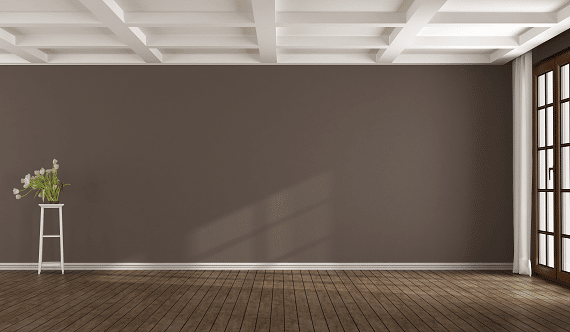
There’s a cosy, welcoming vibe here, thanks to the use of bright colours. Since greys are going out of style, brown has become the new go-to for interiors. To avoid the repetition of black and grey, try brown. It has the coolness of charcoal but the depth of brown in its vibes. There is currently no chill to neutrals, as everyone desires warmth.
2. RED
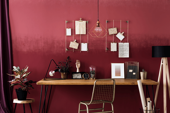
A deep, rich red is on its way! It’s no wonder that it’s making a comeback after a few years, given how high-energy it is.
It’s best to start with neutral paint colour and add strong accessories, like an earthy, clay-colored paint that’s meant to make you feel rejuvenated and cared for in your home.
Mix and match with other neutral elements like linens and carpets.
3. GREEN
Green is a soothing colour that may be used to bring the outdoors inside without making the room feel claustrophobic. Because of this, the reading nook is warm and comforting, just like the bush outside.
If you’re seeking to switch things up from the standard white ceiling, any of the following green shades will do the trick.
• Olive Green is a totally new shade; it’s similar to the colour of newly planted trees.
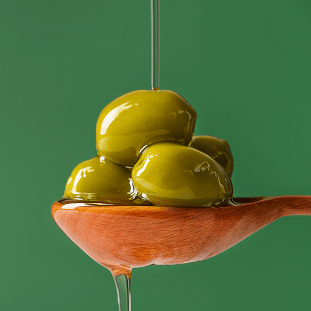
• Oak Green colours with just the proper amount of teal will be trendy in 2023, and the green palette is equally as gorgeous as the rich green.
• Dark Green which is somewhere in the centre, is a soothing medium green that works well to create an atmosphere of rest and relaxation at home.
For whatever reason, ceilings are typically painted white; however, this is not required. The colour palette can go all the way to the top of the walls if so desired. For perfect interior paint, try lighting up the ceilings and walls. The ceiling should be considered the fifth wall.
4. YELLOW
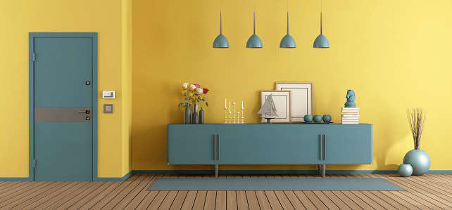
The soft yellow that is a close relative of green, is also making a comeback. Adding a single, delicate shade of colour, the palette is now so creamy and lemony that it might nearly pass for a neutral.
Cohesive and complimentary results can be achieved by combining olive green with yellow-green, both of which contain some black. Alternatively, a yellow-green and blue-green won’t complement each other. They must share a common colour palette.
5. ORANGE
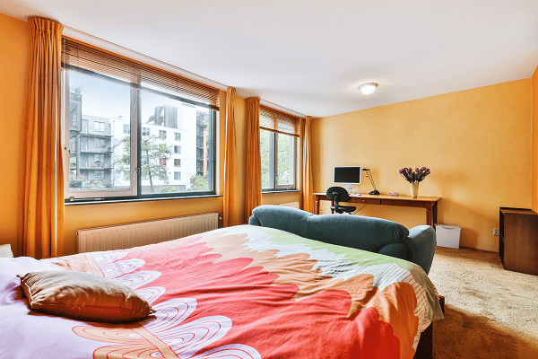
Like carrots and peas, oranges make a great pair. These colours are brilliant, well-maintained, and totally devoid of any dark tones. Yet, they can’t be made habitable without a significant amount of white paint to open up the area and provide visual breathing room.
You could go a little bit crazy if you just paint blue and orange. Because of the white, the colour combination is quite enjoyable.
6. BLUE
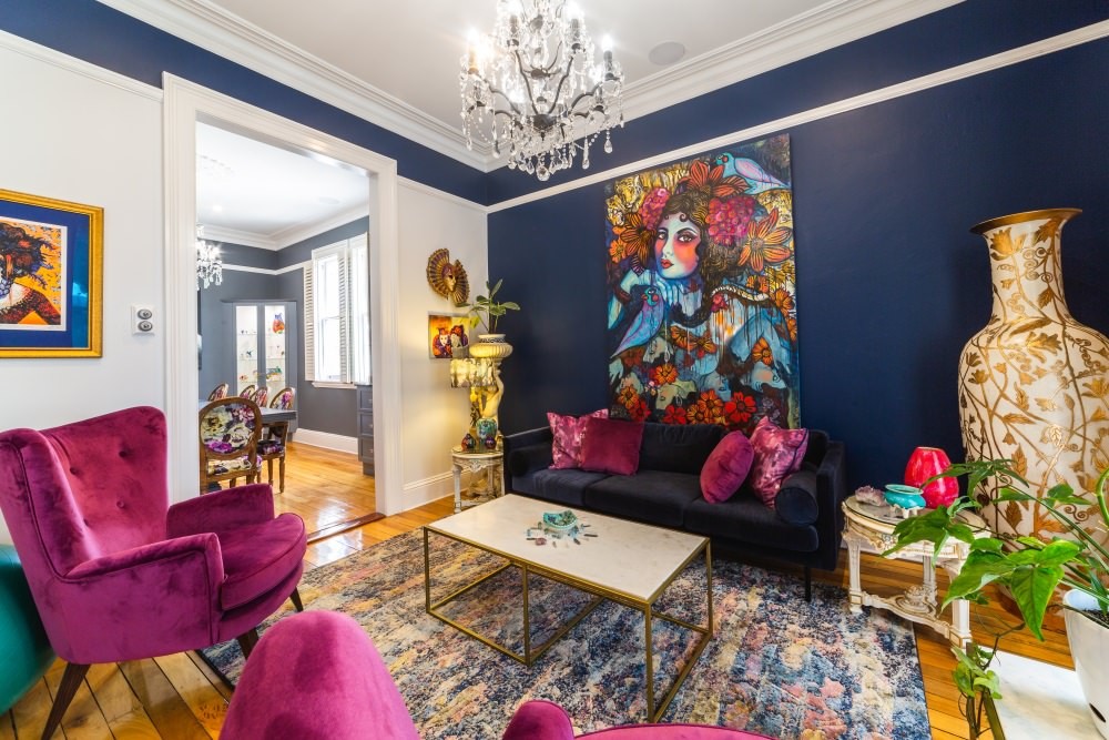
The timeless combination of white and blue works equally well in urban, rural, and seaside settings. This is the kind of colour that would work well in a formal dining room or living area to encourage spirited conversation.
The royal blue interior paint is both eye-catching and trendy. I’s a brilliant concept to pair turquoise with gold, silver, or metallic sculptural accents.
The walls should be a mixture of creams, whites, and beiges with a slight degree of roughness. In order to achieve the appropriate atmosphere, plaster or limewash will be required.
Home is where the peace and tranquillity are, and this colour scheme achieves that by being both light and airy while still feeling cosy.
7. PURPLE
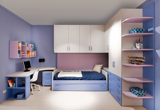
It’s also expected that purple will be a major colour trend in 2023. We haven’t seen much of the eye-catching hue purple employed in bedroom decor, but we like to see it more in the future. According to studies in colour theory, purple evokes feelings of love, calm, and opulence.
8. PINK
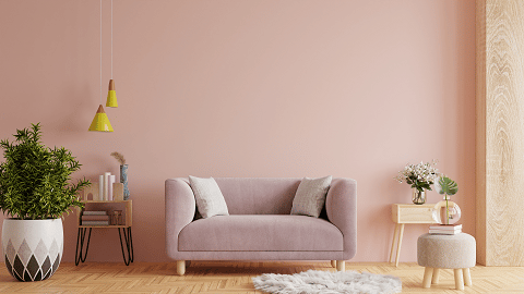
Particularly in the past few years or so, these pleasant neutrals have become increasingly popular, and I believe they are now considered to be essential colours. A dusty pink colour has a calming effect on people, in addition to a feeling of being exceptional and one-of-a-kind.
9. BLACK AND WHITE
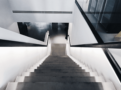
Contrasting black and white has a timeless impact. If you want a classic aesthetic that stands the test of time, but with a twist that makes your room your own, look no further. Since black and white are both neutral colours, they create an effect that is striking without being overpowering. In contrast to white, black can make a statement on a passage door or window sash, drawing attention to otherwise invisible architectural details.
Conclusion
It’s not only about appearances when discussing colour and design. It’s essential that we increase our comfort at home. The goal is to make the house feel more like a place to actually live in again by restoring its warmth and cosiness.
A soothing, calming shade of green that sits in the middle of the spectrum. The earthy peach tone is a lovely, welcoming, and cheerful colour. Contrasting white and black has a timeless impact. After being cautious and cooped up indoors for a while, you can finally use any colour palette you like on your walls.

